It's the Paint Color Post!
- Jul 1, 2021
- 4 min read
Updated: Jul 30, 2021
Hi friends! We've had a busy couple of weeks choosing paint colors (thanks for voting in my insta polls!) and having the rest of the house painted. As promised, I'm sharing all the details here for those of you who've been asking what I decided on...
The previous owner had painted the main living area (kitchen, dining, living room), foyer, hall bath, hallways, and one of the bedrooms in Sherwin Williams "Pure White". Not a bad color (ironically, this was the color of most of the interior walls in our CT house when we bought it, and we ended up repainting everything in Benjamin Moore's "Super White"), but unfortunately they tried to do the job as inexpensively as possible and used a really poor quality paint (SW ProMar 200). For lack of a better description, it feels kind of icky to the touch (sort of gritty / chalky) and almost leaves a powdery film on your hands when you touch it. It shows scuff marks very easily and is really hard to clean (definitely not good with kids and pets!). So, we might repaint these areas later -- maybe when we renovate the kitchen and bathrooms -- but for now we are sticking with it!

In all of the other rooms, there was a fun variety of tropical colors going on: the office (now playroom) and laundry room were sky blue, one bedroom was a peachy flesh color with a lime green bathroom, another bedroom (now the office) was a light yellow with a lemon sorbet (that's the actual name of the paint color) bathroom, the stairs were that same peachy flesh color, and the master bedroom was a cream color with alternating flat and glossy vertical stripes. (The painter actually told me that the dining room used to be brown, the main living area was peach, the hall bath and office were fire engine red, and the laundry room was red & hot pink stripes.... so, Pure White doesn't seem so bad! LOL!).

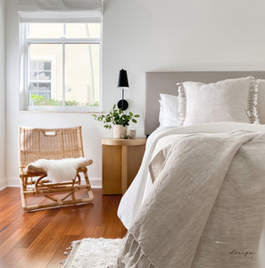
This place needed a serious palette cleanser, and I wanted to go with a fresh white throughout. We tested several of my go-to whites, including Chantilly Lace, Super White, Simply White, and White Heron (all Benjamin Moore). These all look SO different in every space, so I always recommending testing a large area, in different rooms with varying light exposure, to make sure you like it before committing. The same color can look entirely different in different homes, different rooms of the same home, different walls in the same room, and even the exact same wall at different times of day. There is no one size fits all for paint colors, and there is no substitute for testing it out in your actual space. Case in point: I absolutely love Super White in our CT house, but it actually felt too bright and cool in this house. Chantilly Lace also felt too bright here. Simply White, which I thought would be perfect here, actually felt much to yellow. White Heron ended up being the perfect choice, and I'm so happy with how it turned out! It feels fresh and clean, but soft and warm at the same time. It almost feels like a plaster or lime wash finish in some lights, which I love!


But choosing the color is only half the battle; choosing the right paint is equally important! We used Benjamin Moore Regal Select paint on the walls (eggshell) & ceilings (flat), and Benjamin Moore Advance paint on the trim in satin finish. These paints are a little more expensive, but in my opinion, they are totally worth it. The coverage and finish is far superior with BM Regal Select (it took 2 coats with this paint compared to 3-4 coats the same painter needed with the cheaper Sherwin Williams paint) so you actually end up spending more on labor and materials sometimes when you try to save money on the paint. BM Advance is my absolute favorite paint for trim. It has a longer open time, to it is easier to work with, and is self-leveling so it practically eliminates brush or roller marks. It also hardens to an enamel-like finish so it's perfect for things like cabinets or furniture. (Stay tuned for my post about painting the kitchen cabinets!)


Since we went with all white on the walls and trim, I wanted to try out something different and do a light neutral color on all of the interior doors. I tried out several colors including BM Baby Fawn, BM Classic Gray, BM Revere Pewter, BM Natural Cream, Farrow & Ball Cornforth White, and Farrow & Ball Stony Ground. I absolutely love each of these colors and it really was a tough choice. Classic Gray was a little too light, and Revere Pewter was a little too dark. Both Farrow & Ball colors took on a slight purple tone in this house, which was so disappointing because I really love these colors and wanted them to work so much! We stared at the color samples on the doors for a couple of weeks before deciding Natural Cream was the one! It love that I have never seen or heard of it before, but it looks just right! It feels familiar but new & intriguing at the same time. Definitely a color I'd use again! I love the subtle contrast with the walls, and I can't wait to see how it looks with the new unlacquered brass door hardware!


I'll continue updating once we paint the cabinets in the kitchen & bathrooms, but for now, these are the answers to all your burning questions about paint! :)
xo
Marcie


Comments